Every once in two months, the RBI asks around six thousand households in nineteen cities what they think inflation is. In the September 2026 round, the median answer was 8.4%. Asked where it would be in a year, they said 10%.
Measured CPI at the current time is around 4.8%.
| What households say | What MoSPI measures | |
|---|---|---|
| Inflation right now | 8.4% | 4.82% (August 2026) |
| Inflation a year ahead | 10.0% | 5.0% (RBI projection, FY27) |
That gap is not new, and it is not small. In January 2025, households put current inflation at 8.3% and expected 10.2% a year out. In March 2025, they said 7.8% and 9.7%. Measured CPI averaged 2.2% across the 2025 calendar year, the lowest in decades. Households reported perceiving something close to four times that.
The standard explanation is that households are poor estimators. They notice the onion and forget the air conditioner. They remember increases and ignore the thirty-nine items in the basket that got cheaper.
There is a less comfortable explanation. The households may be answering accurately. They are simply answering a different question from the one the index answers.
That distinction matters for monetary policy, and it matters for anyone sizing a thirty-year goal. This edition takes both.
What The Index Is Built To Measure
The CPI answers a precise question. If the country as a whole kept buying roughly what it bought last year, how much more would that cost today?
MoSPI surveys what households spend on, fixes those proportions into a basket of 358 items, and prices that basket monthly. The current weights come from the Household Consumption Expenditure Survey of 2023-24, covering nearly 2,62,000 households. When the index says food and beverages are 36.75% of spending, that is measured, not assumed.
The 2024 base revision was a genuine improvement on a basket that had been frozen since 2012, through twelve years of urbanisation and a decisive shift into services.
| Category | 2012 series | 2024 series |
|---|---|---|
| Food and beverages | 45.86% | 36.75% |
| Transport | 6.4% | 8.8% |
| Furnishings and household maintenance | 3.7% | 4.5% |
| Information and communication | 3.3% | 3.6% |
| Health | 5.9% | 6.1% |
| Education services | 3.5% | 3.3% |
The item count rose from 299 to 358, rural housing entered the index for the first time, and price collection now includes twelve online markets alongside 1,407 urban and 1,465 rural physical markets. It is a better description of Indian consumption than what it replaced.
What a national average cannot do is describe anyone in particular. The index blends a household spending ₹2,000 a month per person with one spending ₹50,000, then prices the blend. For the RBI, which needs one auditable number measured identically every month and comparable across years and countries, that is exactly right. It is the only instrument that can anchor a target.
It is also why the survey answer and the index answer diverge.
August Showed How Far Apart They Can Sit
Last month is a useful illustration because the dispersion was unusually visible. The headline printed 4.82%, the tenth consecutive month of acceleration. Almost none of it was broad-based.
Worth being clear about what the columns below mean, because the two are easy to conflate. The middle column is how much prices rose within that category over the year. The right-hand column is how much of the 4.82% headline that category actually produced, which is its price rise scaled by its share of the basket. A category can rise sharply and barely move the headline if households spend little on it, and rise modestly while dominating the print if they spend a lot.
| Category | Category Inflation | Contributed to the 4.82% |
|---|---|---|
| Food and beverages | 5.7% | 2.09 pp |
| Personal care and miscellaneous | 15.2% | 0.80 pp |
| Housing, water, electricity, fuel | 2.6% | 0.45 pp |
| Transport | 4.6% | 0.40 pp |
| Restaurants and accommodation | 8.4% | 0.28 pp |
| Clothing and footwear | 3.6% | 0.23 pp |
| Education services | 3.7% | 0.13 pp |
| Health | 1.3% | 0.08 pp |
| Information and communication | 2.0% | 0.07 pp |
| Recreation, sport and culture | 1.7% | 0.03 pp |
Food and personal care illustrate the point between them. Food rose 5.7%, a modest figure, but on more than a third of the basket it produced 2.09 percentage points on its own. Personal care rose 15.2%, almost three times as fast, and produced less than half as much, because it is barely 5% of what households buy. Most of that 15.2% came from jewellery rather than from anything bought monthly.
Underneath the categories, the item-level picture is starker. The median item in the basket rose 2.85%. Of 358 items, only 88 beat the headline. Thirty-nine got cheaper. Ginger was up 73.8% and onion 48.3%, while tomato fell 31.1%, and cars fell 6.7%.
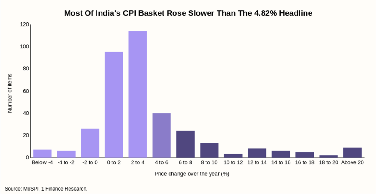
So a household that happened to buy none of the fast risers experienced something much closer to 2.85% than to 4.82%. None of that makes the index wrong. It makes the index an average of a distribution that was unusually wide.
Why The Gap Persists Even When Inflation Is Low
Dispersion explains part of the survey gap. Four well-documented quirks of how people read prices explain much of the rest, and clients exhibit all of them.
| What it does | Seen in August | |
|---|---|---|
| Frequency | Vegetables are bought weekly, a phone every three years. Frequent price changes get observed dozens of times a year and weighted accordingly in memory. | Onion priced weekly. Cars priced once, if at all. |
| Visibility | Increases are salient, and declines rarely are, so the mental average drifts upward even when the measured one does not. | Onion up 48.3% was a news story. Coconut oil down 29.9% was not. |
| Base effect | Prices seldom fall back to where they were, so the level feels progressively worse even as the rate of change stays contained. | 4.82% sits on top of every increase that came before it. |
| Shrinkflation | A smaller pack at the same price is a price rise. Agencies adjust where they detect it, and detection is imperfect. | Felt in full at the shelf, only partly captured in the index. |
Underneath those four sits something structural. If dispersion were noise, it would cancel out, and nobody would systematically misperceive anything. It does not cancel, because the differences track income. Food is 36.75% of the national basket, considerably more for a household in the bottom deciles and considerably less for an affluent urban one, so the same food shock produces very different lived inflation at either end. Research published in the Economic and Political Weekly measuring inflation inequality across Indian consumption fractiles finds inflation volatility has been persistently higher for poorer households, and concludes the pattern is structurally anti-poor.
So perceived inflation at 8.4% against a measured 4.8% is part misperception and part accurate reporting of a different basket. Treating it as entirely the former, which is the conventional reading, discards information.
Why A Central Bank Should Care
Inflation targeting works through expectations as much as through the policy rate. If the RBI credibly commits to 4%, households and firms are meant to set wages and prices as though inflation will be 4%, and the commitment becomes partly self-fulfilling.
That channel weakens when the number being anchored to is not the number people believe they are experiencing. India's households have expected around 9% for years while the RBI has delivered an average far below it. The target has been met repeatedly. The expectation has not converged.
The practical consequence arrives now. The MPC is tightening against a 4.8% print while the household survey sits at 10.0%. If expectations anchor to lived experience rather than to the index, more of the work falls to the rate itself.
None of this argues for rebuilding the CPI or abandoning the target. It argues that the dispersion around the headline carries information the headline discards, and that measuring it is worth doing rather than assuming away.
Which is what a personal inflation rate is for.
What Personal Inflation Actually Measures
Personal inflation is not a rival theory of prices. It uses the same MoSPI price data the headline uses. Food prices are the same food prices. Rent is the same rent.
The only thing that changes is the weights.
The CPI weights come from what the average Indian household spends, measured across nearly 2,62,000 households in the Household Consumption Expenditure Survey of 2023-24. A personal rate weights those same price movements by what one household spends. Their rent, their school fees, their premium, their grocery bill.
That is the entire difference. Both are weighted averages of identical price data, one weighted by national consumption shares and the other by a single household's. Neither is an opinion and neither forecasts anything. It is usually enough to move the answer by one to three percentage points.
Where It Parts Company With CPI
It is tempting to conclude that the official number misleads and the personal one is true. That is wrong, and an adviser who says it to a client will get caught out.
| Headline CPI | Personal inflation | |
|---|---|---|
| Built to answer | What is happening to prices in the economy | What is happening to this household's cost of living |
| Basket | National average, HCES 2023-24 | That household's own spending |
| Independence | High, same method monthly, auditable | Only as good as what the household reports |
| Comparability | Across states, years and countries | Comparable to nothing |
| Refresh rate | Weights updated rarely, 2012 to 2024 last time | Changes whenever the household's life changes |
| Main blind spot | Describes an average household spending pattern | Confuses price rises with lifestyle upgrades |
| Use it to | Read rates, policy and the economy | Size goals and set contributions |
The CPI's strengths are not concessions. It is independent, consistent, published monthly with state detail, and it is the only number that explains why the repo rate sits where it does. No household calculation replaces any of that. But a fixed national basket cannot describe a household whose spending looks nothing like the national average, and because the weights refresh rarely, twelve years passed between the last two, the basket drifts further from any particular reality the longer it sits.
The two are complements. The headline tells you what the economy is doing. The personal number tells you what to put in the plan.
Four Households, Four Different Inflation Rates
The clearest way to show what reweighting does is to take four households any adviser would recognise and apply August's price data to each.
Everything else is held constant. Same month, same official data, same index. Only the weights change.
The Same Month Produces Four Different Inflation Rates
| Household | What tilts the basket | Their inflation rate |
|---|---|---|
| Young metro renter | Rent, commuting and eating out dominate | 4.2% |
| Rural household | Food is close to half of what it spends | 4.4% |
| Retired couple in a metro | Health is a fifth of spending, no school fees | 6.2% |
| Urban salaried family with children | School fees and medical cover are a quarter of the budget | 6.4% |
| Headline CPI, August 2026 | 4.8% |
Two of the four sit below the headline and two above, with 2.2 percentage points between the highest and the lowest. Nobody is living at 4.8%, and which side of it a household falls on is not guessable without looking at what they buy.
💡How one of these numbers is built Take the salaried family. Education is 16% of what it spends, and health is 10%, against 3.5% and 6.2% in the national basket. Everything else, which is food, rent, transport, clothing and the rest, is the remaining 74% and blends to 4.2% on August CPI rates. Multiply each share by the rate that households face and add them up. (74% × 4.2%) + (16% × 12%) + (10% × 14%) = 6.4% The same arithmetic on the national basket gives 4.82%. No forecasting, no judgment about where prices are heading. Only a different set of weights. |
The two above the line share a feature. Both pay for education or healthcare privately, and that is where the index and the invoice part company most sharply. CPI education rose 3.7% in August, and CPI health rose 1.3%. Neither figure is wrong. CPI education prices a national mix in which government and aided schooling dominates, so private fee increases are diluted to almost nothing, and CPI health leans towards generic medicines and routine consumables rather than private hospital rates and insurance premiums. The index is pricing the country's education and healthcare. These households are buying a specific and expensive slice of it.
What The Gap Costs
Take the salaried family at 6.4% against a 5% planning assumption.
| Planned at 5% | This household's own rate | |
|---|---|---|
| Monthly spend at 60 | ₹2,57,300 | ₹5,06,100 |
| Lifetime spend, 30 to 60 | ₹5.0 crore | ₹8.2 crore |
The plan provides for roughly three rupees in every five the household will spend, a shortfall of ₹3.20 crore. Nothing unusual happened to produce that. They sent a child to a private school and kept ageing parents insured.
A single goal shows it more sharply. Fund an 18-year education goal at 6% when fees compound at our conservative 11%, and the corpus required is 2.29 times what the plan targets. At the 12.5% the school audit suggests, 2.92 times.
And a better single number does not fix it, because the basket does not sit still. A child starts school, and a fee line appears. Parents reach their late sixties, and their health costs arrive. College replaces school. Fees stop. Then the household's own health costs step up and never come back down.
| No Single Assumption Fits More Than A Few Years At A Time | ||||
|---|---|---|---|---|
| Age | Everyday living | Education | Health | Implied inflation rate |
| 30 | 93% | 0% | 6% | 4.8% |
| 38 | 74% | 16% | 10% | 6.4% |
| 45 | 58% | 20% | 21% | 7.8% |
| 53 | 33% | 46% | 23% | 10% |
| 60 | 40% | 0% | 63% | 10.3% |
No number in that last column would have served for more than a few years at a stretch, and the one a plan is most likely built on, something near 5%, is only right at the very beginning. The average across the thirty years is 7.8%.
Education and health do not simply cost more. They compound faster than everything else, so their share of the budget rises every year the family keeps buying them. A weighted average pulled by two fast-growing components climbs for as long as they are in the basket
Where A Personal Rate Earns Its Place
Five situations where the household number changes the answer and the headline does not.
Sizing a retirement corpus. The single most load-bearing assumption in the plan, usually picked from habit and rarely revisited. One point of error over twenty-five years moves the required corpus by more than a quarter.
Funding an education goal. The widest divergence of any category, and the goal with the hardest deadline. A separate input here is not optional.
Checking whether a deposit is actually working. A 6.5% fixed deposit returns around 4.5% after tax in the top bracket. Against a 4.82% headline, that looks close to flat. Against a household running 6.0%, it is losing a point and a half a year in real terms, and the client has no way of seeing that from a statement.
Setting a withdrawal rate for a retiree. Our retired couple runs 6.2% with health at a fifth of spending and rising. A drawdown plan built on the headline understates the pace at which their costs grow, in the decade when they can least adjust.
Explaining the gap in a review meeting. When a client says prices feel worse than the news says, they are usually right about their own basket, and the RBI's own survey data backs them up. Showing them their number is a better conversation than telling them the headline is 4.82% and they are mistaken.
One caution. If spending is entered carelessly, or a lifestyle upgrade is counted as a price rise, the number comes back alarming and wrong. A family that moved to a bigger flat has not experienced inflation. Keeping those apart is the adviser's job rather than the calculator's, and it is what makes the number credible.
None of this replaces CPI. It adds the number CPI was never built to give you, which is the inflation rate of the household sitting across the table.